These past few days I have been putting in some improvements to my dodgy custom GUI system.
Introduction
I wrote this originally a few years ago and have gradually been tweaking things as I use it, kind of like Han Solo and the Millenium Falcon. Writing my basic GUI was not all that tricky (it started out as a game UI), and quite fun as a learning experience. I'm sure writing a really good one takes a lot more thought.
As a quick intro, I was able to take lots of shortcuts because it is totally a software GUI, it renders everything on the CPU, then transfers whatever changed to the GPU (using OpenGL / OpenGL ES, but any flavour API will do for this). It also can render OpenGL into 3D windows. It is very low footprint, allowing windowed apps in the realms of 200k or so, and is pretty good with RAM too, and is multi-platform, windows, linux and android so far, should be fine on iOS.
Improvements
First most obvious thing was I wanted to improve how it looked. Being a programmer I'm usually more interested in spending time on code than on tweaking design issues, but I have to admit the previous version looked something like windows 3.1:
I resolved to dive into the 21st century and do a 'dark theme', and at the same time revamped how widget colours and filling is handled.
In classic 'seemed like a good idea at the time', the widgets were drawing themselves, calling some common functions but essentially making the design decisions in a bunch of widget classes. This is all great object orientated design, until you come to try and make the widget colour schemes etc work with each other and you have to keep track of 2 dozen classes.
So at the expense of 'infinite customization' I have simplified it all having a massive widget enum of all the widgets, then in a common routine using a switch statement to categorize them into a few different 'fill styles'. Then the design task becomes one of trying to make the smaller list of 6 or so fill styles work with each other rather every damn widget. It also makes it easier to make themes.
The old code did gradients and a few fancy things but the new code only does flat shading and a few edge styles. I might add a few more things if I have time, like curved corners, possibly gradients, but gradients makes the font rendering a bit more involved (if the font background matches the fill colour, you can just copy rather than blend fonts).
Anyway this is things so far, I haven't exported a second font yet so the fonts look samey, and I haven't figured a good way of emphasizing the data blocks on the left, but I'll get there. I could put more edge accenting on everything like the last version but I found it a bit distracting to the eye.
And the borders are all only 1 pixel wide at the moment, it is possible a graded 2 pixel border will look better.
Aside from the looks I want to carefully go over the 'API' exposed to the user to see if I can simplify it. Simpler API is easier to use, quicker to use, and less prone to mistakes.


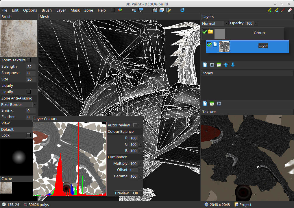
Looks great. Reaching the point when you want to apply themes and styles and what not brings on a lot of "hmmm well shit" moments I find. How are the Widgets being drawn in the new system?
Also I personally love the flat shaded style compared to the former. It feels more modern and stylish I find.