Hey all,
Let me preface this by saying I'm a shit drawer and would not call myself an artist, impressionist, or anything that takes lots of experience.
I'm making a low-light 3D game for OUYA. I want to use fairly simple assets with low poly counts but make them very attractive (with practice) by sort of texturing them with a starry-starry night impressionism.
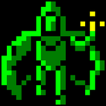
Here's a screenshot of my attempt.
If any artists want to give me advice or if any skilled experienced 3D pros want to warn me against wasting time I would greatly appreciate it.
[attachment=18639:pre-alphaVG.png]
(P.S I see that annoying blue line...I've tried a million times to find it and fix it)
🎉 Celebrating 25 Years of GameDev.net! 🎉
Not many can claim 25 years on the Internet! Join us in celebrating this milestone. Learn more about our history, and thank you for being a part of our community!
Going for Impressionism in 3D Assets

Author

So, in essence, you're doing some broad handpainting? That in itself is a great idea! Could look really cool.
In the screen provided, it's hard to tell how good the end result will look because the lighting is very poor. Low light is one thing, but surely there's a nicer way to go about it than this. A more... glow-y source light? Some glowing objects, I don't know, it needs to be lightened up a bit. Right now it looks like a flash from a smart phone and that's not incredibly charming. Not sure of the limits of the Ouya (or your engine of choice), though, but I'd do some thinking in regards to the lighting.
But you're not here for lighting advice, so I digress, texture style is looking nice! Messy, but it looks a lot like it's meant to be that way and definitely gets the point across in an attractive manner. Impressionism, yes, would be a good word for that.
I would really look towards neatening up the seams; they're very visible right now and it's very jarring. If you're hand painting, you may be able to cover some by adding things like a nice painted highlight to the corners and edges of objects like the pedestal holding the crystal here, that would hide the seam nicely, I think. May also be worth it to do something to make it look like the hard edges are 100% intentional and not just a result of being forced to work low poly/no normals. Some more purposeful shading or highlighting could be good, and you've done a good job with this on the crystals, I think. The rock could use a little work.
I'd like to see more, honestly.

If you are looking at impressionist paintings (google search) you will notice all are very colorful, full of light and "alive". I am not sure you will be able to pull that out in a game that has low-light as its premise.
Author
So, in essence, you're doing some broad handpainting? That in itself is a great idea! Could look really cool.
In the screen provided, it's hard to tell how good the end result will look because the lighting is very poor. Low light is one thing, but surely there's a nicer way to go about it than this. A more... glow-y source light? Some glowing objects, I don't know, it needs to be lightened up a bit. Right now it looks like a flash from a smart phone and that's not incredibly charming. Not sure of the limits of the Ouya (or your engine of choice), though, but I'd do some thinking in regards to the lighting.
But you're not here for lighting advice, so I digress, texture style is looking nice! Messy, but it looks a lot like it's meant to be that way and definitely gets the point across in an attractive manner. Impressionism, yes, would be a good word for that.I would really look towards neatening up the seams; they're very visible right now and it's very jarring. If you're hand painting, you may be able to cover some by adding things like a nice painted highlight to the corners and edges of objects like the pedestal holding the crystal here, that would hide the seam nicely, I think. May also be worth it to do something to make it look like the hard edges are 100% intentional and not just a result of being forced to work low poly/no normals. Some more purposeful shading or highlighting could be good, and you've done a good job with this on the crystals, I think. The rock could use a little work.
I'd like to see more, honestly.
I actually am slightly here for lighting advice but I didn't want to overload the question. Since the darkness is a sort of quirky gameplay aspect I think it will need to be tweaked to perfection in order to make it enjoyable.
All of the artistic advice has been written down and taken to heart. Also, I am very excited that you want to see more! That's the feel good part of this business.
If you are looking at impressionist paintings (google search) you will notice all are very colorful, full of light and "alive". I am not sure you will be able to pull that out in a game that has low-light as its premise.
I think you are mostly correct. I had the notion that the lower level of light would force people to look closer at textures revealing the color, full of life. I have impressionistic painting rotating as my background in hopes to absorb the style through osmosis. Once I get a proof of concept thing going perhaps it will become more apparent if the low-light premise will work.
To fix the texture seems just stretch the image longer than the uv.
Check http://www.3dtotal.com for 3d modeling tips, http://ctrlpaint.com/ for art tips and it will help improve your texture quality.
For low poly modeling focus on edge flow and topology, and learn how to use normal maps.

The final product the player will see is still to have those paintings wrapped on surface of models and then projected according to camera view frustum to produce rendered image. In simpler terms, the shape of models also greatly affects the visual style.
I see some hard edges and sharp points which in my opinion don't really support the brush painted style. Textures you have are vivid, organic and sympathetic in nature but model shapes seem cold, industrial and rational even though I can see you've tried to get nonlinear with them. Perhaps you can spare few more polygons and smoothing so you get genuinely round shapes?
So I would love to see some more impression in 3D shapes as well so that the final product (rendered image) would look unified in style.
Also think about the lighting. Traditional 3D rendering with pixel lighting results in all the paintings fading towards black and also nothing is quite "full bright" so that the painting would really display the colors it was painted with. This flattens the impressionistic brush style a bit. It could be cool to use "no shading" approach but that would be totally different game aside from the whole "low-light" starting point. Try to bring clear contrast between different foreground and background objects, if not entirely via luminosity then via hue.
That being said you still probably want to find and experiment with a lighting style that would support impressionism and highlight the painted style and work with your low light game design idea. Even if you base your image tones to lower end of the histogram, perhaps you could also keep the upper end in your game via using for example some tiny brighter spots or white HUD elements. That way you could still make use of the whole histogram and thus follow one of the basic guidelines of all graphics art. ")
Just remember that when you are designing style it is more than textures. Lighting, models, animation and movement, effects, HUD elements, everything constitutes to the whole that the player will see.
This topic is closed to new replies.
Advertisement
Popular Topics


Advertisement