🎉 Celebrating 25 Years of GameDev.net! 🎉

Not many can claim 25 years on the Internet! Join us in celebrating this milestone. Learn more about our history, and thank you for being a part of our community!

Style for a game, feedback much appreciated.

Started by
3 comments, last by kalamelle 7 years ago

I'm creating a game that will simulate a simple economy. One where thousands of individual AI will participate in farming, logging, hunting, war and so on. The player(s) will be able to participate in the simulation and influence the direction of some of the AI in an attempt to win majority influence over all AI. The players will compete against other players.

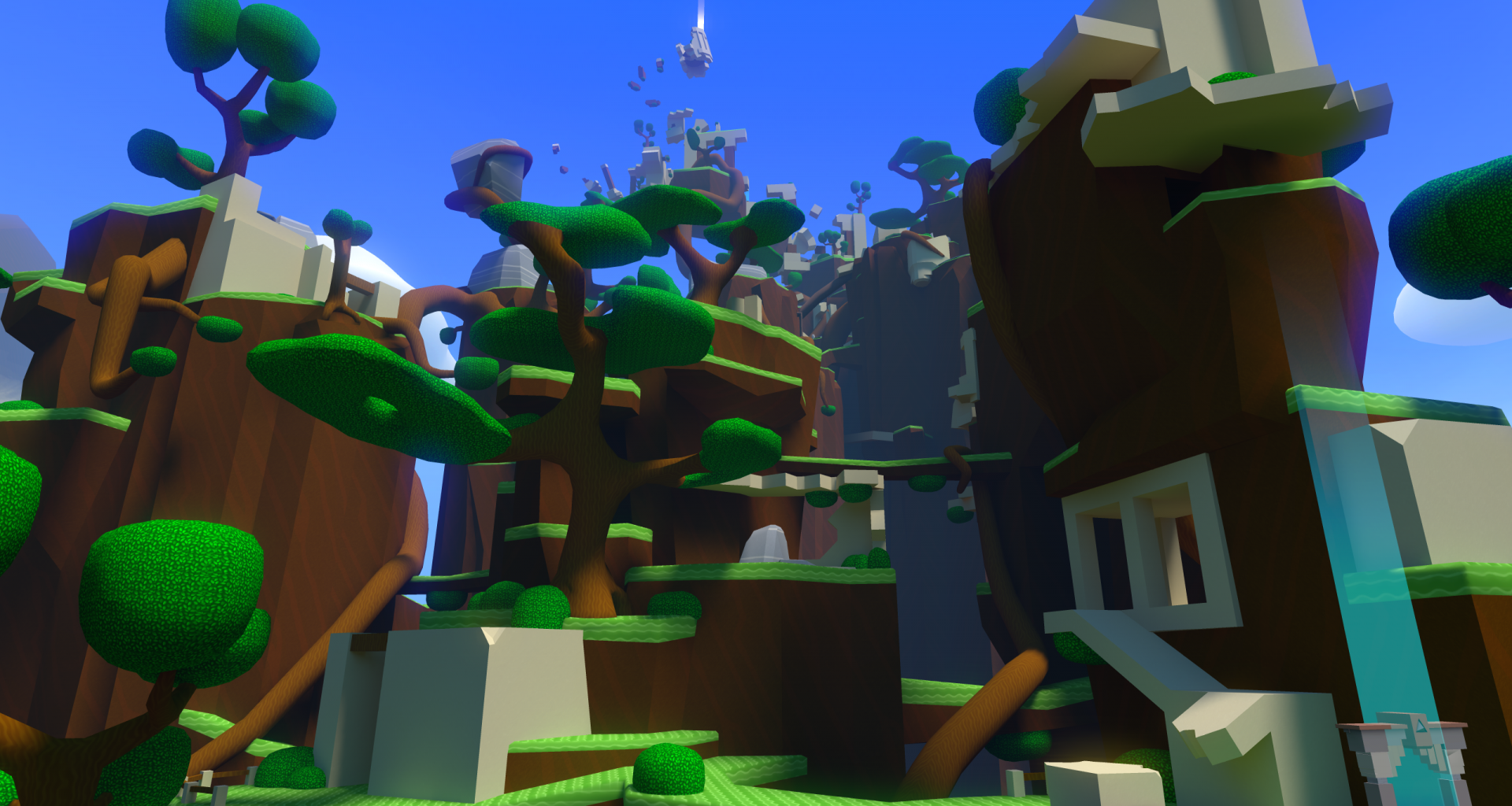
Imagine for a second what this game might look like if it was 3D and was on a 3D planet. What level of art would you deem acceptable? If it was a browser game?

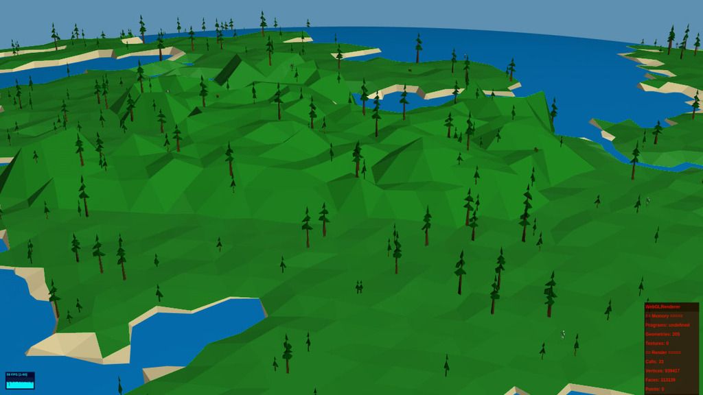
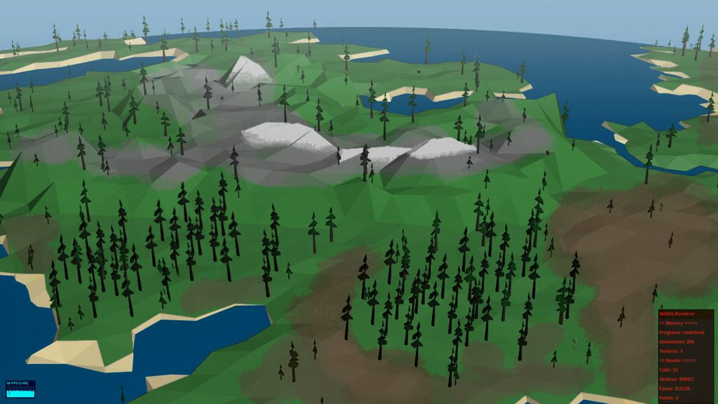
In order to achieve this lofty goal I've had to sacrifice visuals. In addition I'm not a kept artist and it's been a number of years since I've furthered my art.

Here is my conundrum, as of right now I'm attempting to make this game look real---ish in order to visually capture a human relate-able-ness for the game. I worry that the current look may take away from the intended objective of the game( which relies heavily on the players imagination to generate purpose and drive to play, much like classic Civilization, Simcity and 4X games. ) I'm biased when I see progress in the way this game looks, but only because it looks better than the last build I created.

I've attached some proposed pictures for the intended style, please critic them in any way. I can only make this project better if people tell me what's good and what's not. Does the style I'm currently working with take away or add to the game's idea? Does the art and style draw you into this idea more or does it disinterest you? If it disinterests you I'd like to hear your thoughts on what you'd expect and want from a game that does the proposed I've outlined in the first paragraph.

Thank you very much, I'd value any and all feedback.

Advertisement

It looks pretty incomplete so far, so it's a little hard to comment too much.

The terrain color is too saturated, meaning the green is way too bright. Even for a cartoony game, that color is too garish. Bright colors can be tricky because they can be hard to coordinate well. If you want to maintain a simpler look, I would take cues from similarly stylized games. For example, your screenshots remind me of Windlands. That style is entirely appropriate to me for a browser game.

Not sure if this is a future feature, but it could use more variation in the terrain, like different biomes in Minecraft. Forests, deserts, plains, etc. You already have some coloration by altitude, so I would add a few more colors in addition to what you have. Placing trees in clumps in addition to randomly would be nice, too.

Also, it took me a long time to notice the little people, I would definitely think about how to make them stand out more from the ground.

Here is a quick photoshop example of some of the colors toned-down:

GamedevExample2.jpg

Here's another, made more "realistic," more terrain variation in this, and some forests, and some distance fog, plus muted colors.

GamedevExample.jpg

Good luck!

-Mark the Artist

Digital Art and Technical Design
Developer Journal

hm, i think the trees look wrong. they would have to be a lot smaller and there would have to be a lot more of them to fit with the scale of the landscape. maybe don't even model single trees but rather patches of dense forest. thinking CIV 5. in fact rather go without trees than with those. forest patches could save a lot of polygons, and still look proper with the right textures and shaders.

Prinz Eugn, What you did looks incredible! Thank you so much. I am literally going to incorporate most if not all of your suggestions. I'd like to capture that colour pallet you've used. Thank you so much for the feedback, it is very much appreciated.

ninnghazad, yeah that is a good idea, I was thinking about clustering the trees at further zoomed out levels... not sure yet how to do it. One tricky thing I have to work with is there is full zooming capabilities with this. You can zoom all the way in on a person, or all the way out on the whole planet. So the style needs to look decent enough at all zoom levels.

This actually reminds me of a documentary I watched about Frank Lloyd Wright. When he designs a building he designs it at multiple zooms. He makes a small model and pretends to look at it as from an airplane or helicopter. Then a medium model and pretends to be looking at it from within the city down the streets. Then another yet large as though you're standing right in front of it.

Hi. Don't use too much flashi color. Especially for important part of your games (sky, water, earth.) it will be bad for eyes. But you can use flash color for some "rare" item or else. I think it will be better for the visual.  :)

This topic is closed to new replies.

Advertisement