Hey guys!
So I made a map recently for a fictional world. Nothing special just some pixel art stuff but I wanted to ask you if any of you have some suggestions or advice for making it more "realistic" or better.
Thanks.
Not many can claim 25 years on the Internet! Join us in celebrating this milestone. Learn more about our history, and thank you for being a part of our community!
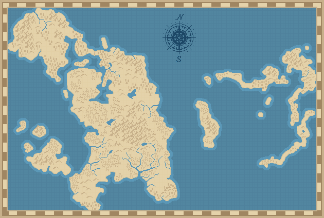
Hey guys!
So I made a map recently for a fictional world. Nothing special just some pixel art stuff but I wanted to ask you if any of you have some suggestions or advice for making it more "realistic" or better.
Thanks.
looks good to me. More realistic? we'll I guess that's open to a lot of interpretation. But the one thing I could mention, which may or may not be a bother for you, is it looks like the land was drawn with a brush about the size of the one island on the right hand size that looks like a circle. I would say maybe make the edges of the land look a little more jagged???
A very nice style.
It's too monochromatic in its current state, but if you add captions and cities, boundaries etc. the added black marks should improve the situation; otherwise you might adopt more varied traditional colours (greener plains, browner mountains, touches of white ice or snow...).
Whether it's a good map or not depends on its purpose. What is the player expected to look for? Political boundaries? General layout of important places? Distances and obstacles to plan travel? Moving battlefronts?
One thing to do would be to add different colors for different environments, like LorenzoGatti mentioned.. Make the forests green, the the arctic white, the mountains greyish, etc. I would be careful to keep it subtle (like use really desaturated colors) so it still looks like an old-timey map. Often on real maps the color is by elevation, which is called hypsometric tint if you want to search for examples.
I'm not sure how you're integrating the interface, but consider adding some labels. Maybe even just for the oceans to keep it clean. I whipped up this example below in Photoshop to think about it.
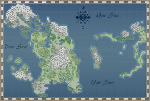
Some tinier islands wouldn't hurt, like in the archipelago, or maybe something like some fjords to add some visual interest by making the shore sharper in places as Awoken mentioned. Hm, and I didn't see anything that screamed "desert" to me, so that might be something to think about (sand dunes?).
I would also think about adding representations of cities, ruins, caves, etc.in a similar style to how you have the hills, assuming you want more detail.
Of course, how much detail you want on the base map depends on how much stuff you are going to put on top of it in the game, If you're going to have a bunch of icons for stuff on top, I would not add very much other than some color personally.
What might be interesting is to take one section of the map and blank it out. Make it one colour, dotted line around it and put "the unknown lands" or "do not enter". Leave it at that and wait to see what the viewer imagines to be there?
I like the map so far, keep it up!


