🎉 Celebrating 25 Years of GameDev.net! 🎉

Not many can claim 25 years on the Internet! Join us in celebrating this milestone. Learn more about our history, and thank you for being a part of our community!

How to improve this battlefield? (2d tiles)

Started by
3 comments, last by Irusan, son of Arusan 5 years, 3 months ago

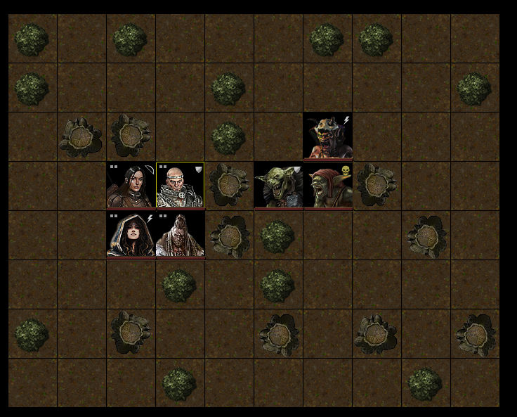
Turnbased tactical combat. This is an outdoor fight in a forest. Open land, small bushes and trees (shown as trunks right now).

It doesnt look so good :)

Any idea on how to improve it? Examples of such games?

More symbolic representation of the tiles maybe? The unit sprites ("faces") will pretty much need to be in this style. But the obstacles (bushes and trees) needs to change i think.

screenie.jpg.ce1838cf33f78abbd8df653614c20b62.jpg

Advertisement

Some thoughts:

1. The character art is gorgeous. Unfortunately this makes the rest of it look worse by comparison.

2. The square character frames are dull. Could you give them a border and a bit of separation from each other? And maybe vary the backgrounds a little? They're all very black square.

3. The ground is very uniform and boring, some variation would make it look a lot nicer. For example, adding a worn footpath, fallen branches and leaves, or some clumps of forest flowers would go a long way to livening the scene up. For bonus points, make sure the divisions in the ground don't match the grid shape.

4. The shadows are inconsistent. You're just rotating the same tree trunk for variation, but doing so makes your lighting inconsistent, and this looks bad.

5. Everything is pretty central to the squares, rather than pushing the edges, this emphasises the unnatural blockiness of it all.

Pushing things a bit further, real trees have canopy, could you show the canopy either with a transparency, or a transparency as characters move under it? Or, alternatively, show the pattern of shadow and light falling from the canopies to give more variety and life to the ground?

Good points!

However, I want to preserve the chess-board (board game) feeling, that is intentional. I think instead of adding realism in the form of transparent canopies etc I should use more icons or something. The characters are seen from the side, maybe obstacles should also be side-view or orthagonal?

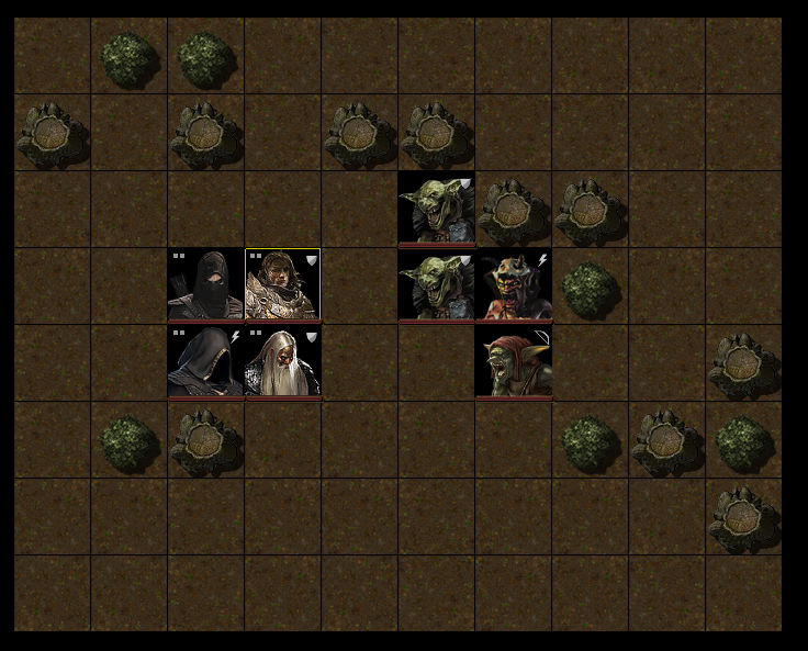
Just removing rotation and adding a simple shadow:

screenie.jpg.905c73c3917a08f3c4063e33fc0ef32f.jpg


4 minutes ago, suliman said:

However, I want to preserve the chess-board (board game) feeling, that is intentional. I think instead of adding realism in the form of transparent canopies etc I should use more icons or something. The characters are seen from the side, maybe obstacles should also be side-view or orthagonal?

That's a total valid style choice, and if that's the route you want to go I would play into even more strongly. Maybe you could stylise the ground, rather than using a "mud" texture. I agree that using more stylised, or side view, icons for the obstacles would likely work. You could even consider going as far as abandoning relative scale, so that you have whole trees the same size as goblins.

This topic is closed to new replies.

Advertisement