🎉 Celebrating 25 Years of GameDev.net! 🎉

Not many can claim 25 years on the Internet! Join us in celebrating this milestone. Learn more about our history, and thank you for being a part of our community!

Character art compared to background scene

Started by
13 comments, last by A_Mc 5 years ago

Hey everyone, this is my first ever forum post in my life lol but I wanted to gain some thoughts on a topic that hinders my creative process on numerous occasions! 

Finding a balance between my character designs and my background designs usually gets me in a predicament where I have to completely change one or the other or delete one. Ive been practising everyday and draw nearly 5 hours plus most days. 

I feel I'm getting closer to my preference but would like some tips on how I could keep my background visually connected to my character?


if I make no sense, please move on lol but thanks!

Advertisement

this is a 2d question. only be concerned with one at a time. focus solely on the character or the background. you can put them together after each is done

I think we can do better than that. 

@Mr Jet Instinctively I want to go to color palette, major shapes or proportions but there really isn't anything to start a conversation with yet. Perhaps we could have an image to dissect together?

Thanks for the replies! And yes, definitely is a 2d question which I'll state in future posts ? 

okay, so I'm currently creating my first platform type game ( First game ). I like the simplicity of my character styles but my background require more contrast and small things I know I'm missing but I can't figure it out.


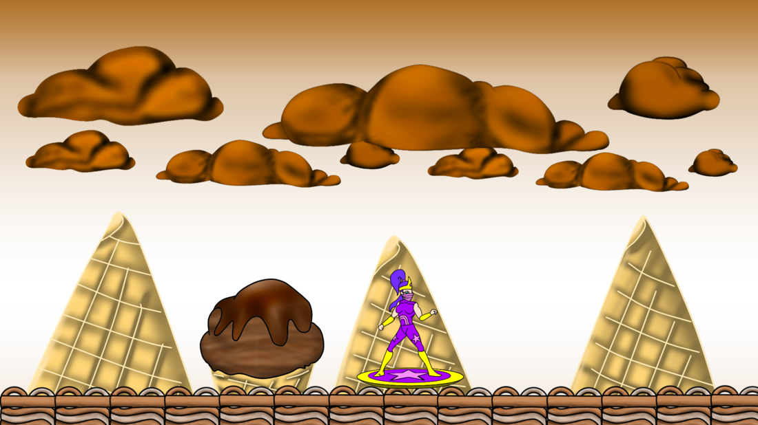
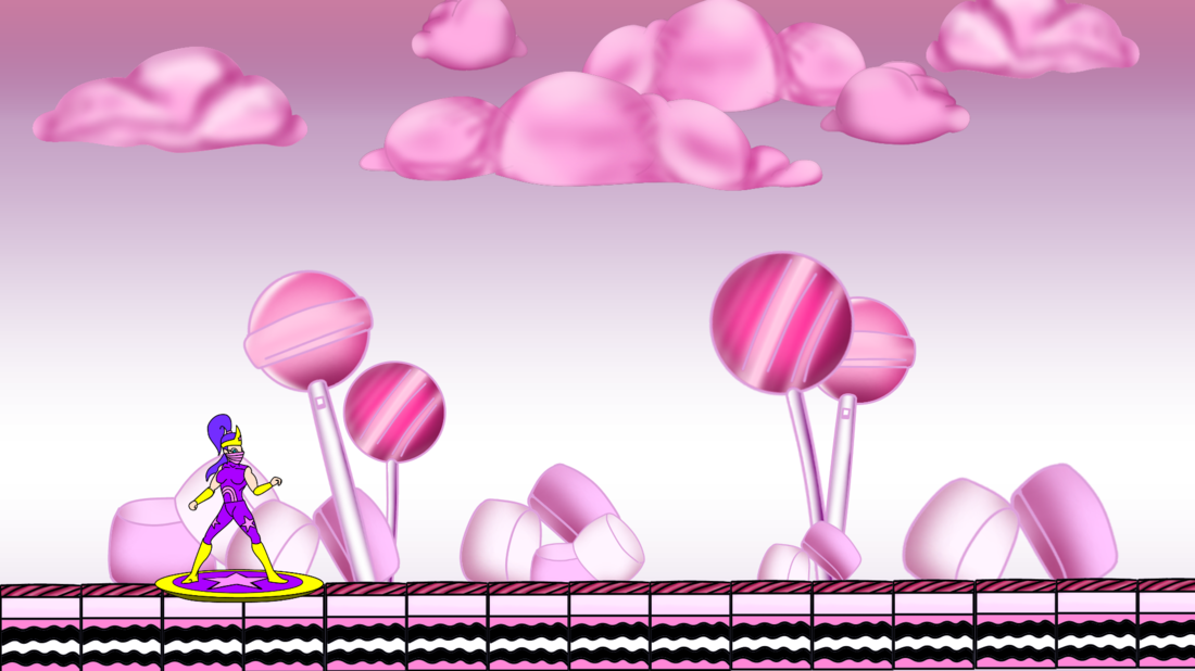
here is a pic of 2 stages and a character. Thoughts and pointers would be more than appreciated! I will send screen shot of actual game when I get back to my pc.

766BD24A-B4AB-4760-9052-DB28490E47F2.png

7A77D902-9F1B-4AF0-9B72-920E66CEED6D.png

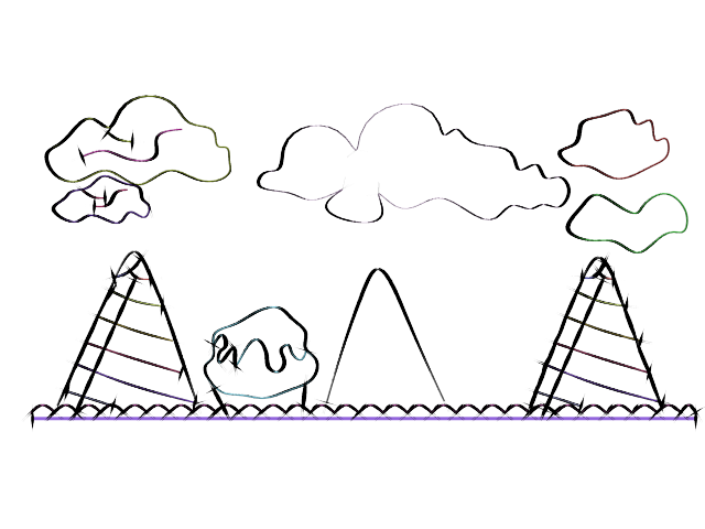
the theme of the background is clear. but does not appear to be hand drawn. seems to be 3d. in your 2d program paint/trace on top of the background to get something more fluid

As a learner, that's interesting. To me, I see the opposite. I see 100% hand drawn with a strong shadowing technique. Even so...I appreciate two images here. You've covered color, shape and proportion. Perfect. We can talk about that. I can see what you mean about the disconnect. I feel what might be missing is visual story and contrast. In both cases the backgrounds have giant hand held items but a tiny character. Works just fine, but why?  What else can be added to complete the 'what' is going on here. 

It's difficult for certain. I also tried viewing the images through some filters to see what popped out at me, but that was little help. Then, I started hunting and found http://artprompts.org/backgrounds-make-you-better/ which suggests there should be story in the background to strengthen the character art. 

@tyree I am aware of some past writings. Perhaps, from this well of past, we might share something a little more than what I concluded as "hand draw on top to fix" No disrespect, please forgive the programmer in me. (I know)

You said you want to make your backgrounds visually connected to your character, but your images show that you need to work more on your fundamentals first.

You're using a lot of airbrush, and not in a good way. Surfaces are looking pillow shaded. Try making sure that you clearly have the right kind of shading transitions (sharp, soft and sharp-to-soft).

If you need inspiration on illustrated candy, you can search on Pinterest or this guy's girl's gallery which is amazing: https://www.shutterstock.com/g/natis76

Compare your ice cream cones with these, see how these artists handled the shading: example 1, example 2.

I told him to trace over it. because that could lead to him learning more. this is a trace of the image with subtle changes

cone.png

You have lots of smooth gradients in the background, but none at all in the foreground.  This visually separates the foreground from the background.

In your first image, there is also a huge amount of color contrast between background and foreground.  You might want to use a color filter on the foreground to bring them closer together.

You have no shadows at all - in the foreground, in the background, or between them.  When I see an object floating in 3D space (as the foreground character appears to be), my eyes automatically search for shadows that I can use to locate the object in 3D.  When there is no shadow, the object does not look like it is a part of the scene.

Another thing that could really pull the elements together is if they were all shaded as if the light was coming from a consistent direction.  These are the two elements that are necessary for an altered photograph to fool the eye: consistent lighting and consistent shadows.

This topic is closed to new replies.

Advertisement