Hi
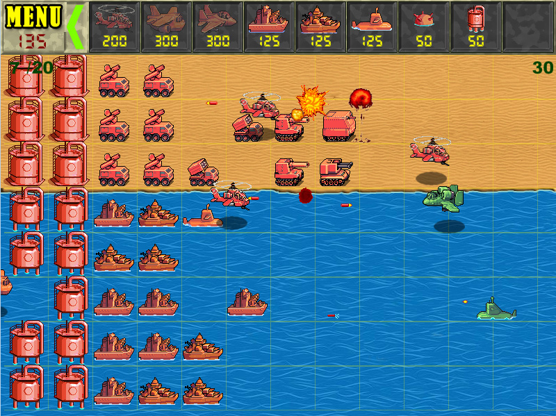
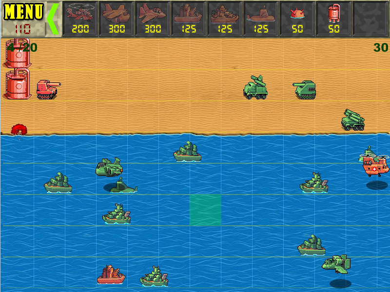
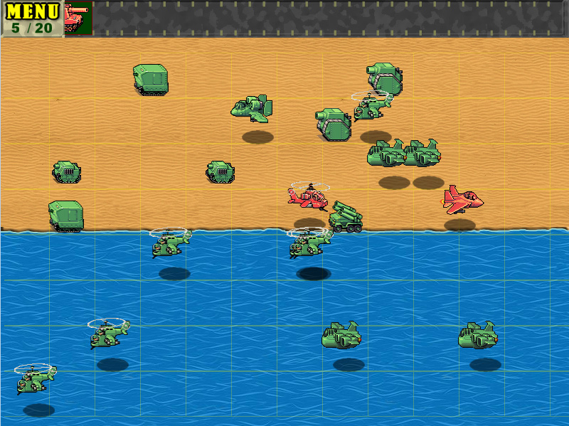
This is my new game. What do you think about the design and appearance of the game?
please help me.
Thank you
Download link : https://shahin54.itch.io/clash-of-small-army
Not many can claim 25 years on the Internet! Join us in celebrating this milestone. Learn more about our history, and thank you for being a part of our community!
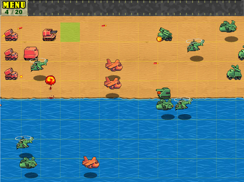
Hi
This is my new game. What do you think about the design and appearance of the game?
please help me.
Thank you
Download link : https://shahin54.itch.io/clash-of-small-army
The choice of red vs. green is quite daring. It can work (iirc. Destiny used it for its grading, at least initially, achieving a distinctive and unique look), but it dominates, so you have to respect such dominance with everything else. But you don't do this.
The background colors are equally saturated and bright as the units in the foreground, but hue conflicts a lot. What you get is like pressing all the keys on a piano at the same time. It does not fit together. There are rules of how to build a chord, and there are similar rules of how to build a pleasant palette of colors.
Notice this also affects perception and thus gameplay in a probably unintended way. In the water the red units pop out, the green units vanish. On sand it's vice versa.
Imagine to make all background just grayscale, and eventually darker. It would be less exhausting to look at the game (which we might do for quite some time), and the units would be easier to see. Similar to the GUI elements on top.
Maybe not the look you intend, but something to try out quickly so you can draw conclusions.
Another way would be to add contrast to shading of the units. There is no white, but you could use it. The red units could use red instead rosy, and a darker red in shadow. (Rosy is really hard to combine with other saturated colors.)
Hue can also be used for shading, e.g. a palette of white > yellow > orange > red, or white > cyan > blue, for a very saturated, cute, punchy look.
In any case the background could use some low frequency variation. Like some Rocks and foliage here and there. Without black outlines, so it remains subtle background. And multiple shades of sand, eventually.
Background is always hard. I wish it would be still 1980 and we could just use black for everything. : )
The choice of various fonts also feels a bit chaotic. The modern digital numbers do not fuse with the stamped Menu font, which feels like from an older period of time, although military. The bold Arial/Helvetica for numbers feels neither, thus conflicting with the other too as well, and it's hard to read. But no big issue, just to mention.
That was a lot of critique on visuals, i admit.
But the line art is really nice. Just the sense of color isn't the best. I feel like there is some potential lost, otherwise i would not reply at all. It's meant as constructive critique.
You may want to look out for artstyle examples with reduced or subtle use of colors, or find help form somebody with better sense for colors to help out.
The very first thing i would do is replacing the green tint of the grid overlay with either white or black - transparent as is, but no color at all. Should look a whole lot better already i think.